Guide: Cholera outbreak report
Source:vignettes/cholera_intersectional_outbreak_guide.Rmd
cholera_intersectional_outbreak_guide.RmdThis guide was written by Applied Epi. Feedback and suggestions are welcome at the GitHub issues page
Introduction
Purpose of this guide
This guide accompanies the Cholera outbreak report .Rmd file, which can be used to create an automated outbreak report for cholera.
Who this guide is for
This guide and the sitrep code is intended for individuals who already have some familiarity with R but want ready-made code to make the report production process faster. You need to be able to edit and troubleshoot code.
Outbreak report contents
The report will contain basic information on person, place, and time, specifically:
- An overall epi summary with bullet points and epicurve
- Age and sex distribution
- Disease/dehydration severity
- Attack rates and case fatality ratios by age group and geographical areas
- Vaccination history
- Laboratory test results
- Detailed outcomes
- Maps and more detailed geographical breakdowns
Instructions
Structure of the outbreak report Rmd
The outbreak report Rmd is split up into sections with chunks which relate to:
- Report set-up including package installation and setting definitions
- Importing data
- Cleaning data including standardising categorical values, removing illogical values, removing unnecessary rows and columns, and creating columns needed for analysis
- Analysis
Only the outputs from the fourth section on analysis will be visible in the report when rendering it.
Note there are comments throughout the Rmd file which refer to the relevant sections in this guide. The comments look like this:
<!-- ~~~~~~~~~~~~~~~~~~~~~~~~~~~~~~~~~~~~~~~~~~~~~~~~~~~~~
Comments are shown in the code between these special lines  They will not appear in the report output
~~~~~~~~~~~~~~~~~~~~~~~~~~~~~~~~~~~~~~~~~~~~~~~~~~~~~~~~ -->
How to produce the report
With the help of this guide (specifically section 3), you should produce the report via the following steps:
-
Go through the outbreak template .Rmd in detail and make
edits as needed. Make sure you run the code within
chunks and inspect the data as you go, to make sure you
correctly and appropriately edit the code. There are several sections
where code edits are required (highlighted in this guide in yellow) or expected (highlighted
in this guide in green):
- ⚠️Required: The YAML, to specify the title, location, MSF office, and date of report.
- ⚠️Required:
The
definitionschunk, to correctly define the reporting date and other key objects. Make sure the date here matches the one in the YAML. - ⚠️Required: The data import section, to import the correct data
- ⚠️Required: The recommendations chunk, to add text based on the results.
- ⚠️Expected: The various data cleaning chunks, to ensure that data is appropriate for the report.
- ⚠️Expected:
The analysis chunks, to ensure the analysis or
presentation is appropriate for the data. In particular:
- Make sure you use the correct date for epicurves and other temporal analyses. The default uses a column that prioritises onset date if available and substitutes with notification date if onset is not available. It may be more appropriate to use only onset date or only notification date, depending on your data e.g. completeness and reliability of both.
- Ensure that missing values are correctly used. The default is that “Unknown” or missing (NA) values are presented as “[Missing]” in tables and are excluded from denominators.
- Ensure the correct geography columns are being used. The data has three levels (adm1, adm2, and adm3). By default, most geographical breakdowns in this report (tables and maps) use adm2 level, there is a detailed table for cases by adm3 level at the end, and adm1 is not used.
- Adjust the map legend as needed so that the categories are appropriate (explained further in relevant section)
-
Adjust other presentation features, such as column
widths in tables, the space between date labels in the epicurve x axis,
or the
fig.heightoption in chunk labels to change the height of figures.
- When you are happy with the Rmd code, click “knit” at the top, which will produce the outbreak report.
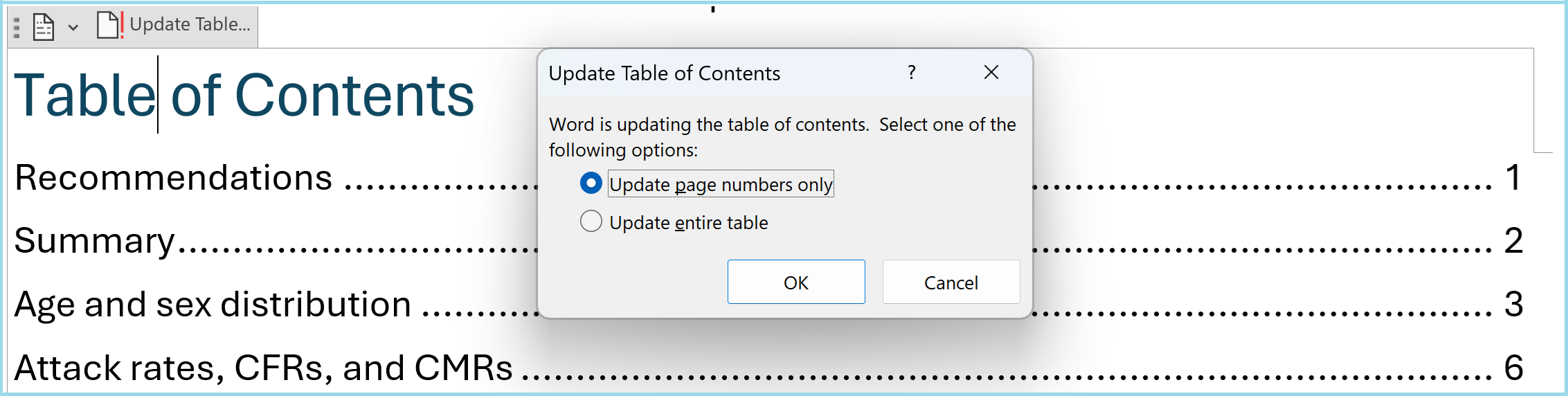
- Take extra steps in MS Word to activate the table of contents: When opening the produced word document, click “Yes” in the popup asking “Do you want to update the fields in this document?”. Then click on “Update Table…” at the top left of the table of contents and update the page numbers, so that they accurately represent the location of each section. See below:
Requirements for report generation
You will need:
- A cholera linelist, with the following requirements:
- One row per case
- Information on: sex, age, geographic location, date of clinic visit, symptom onset date, dehydration levels, vaccination status, outcomes, lab results for RDT, culture, and PCR, outcomes and associated dates.
- Column names and categorical values that align with the MSF intersectional linelist
- Population data for age groups and geographic areas of interest, if you want to create the case rates per area.
If you need to change your data into this format, do so with the outbreak report recode Rmd file first
Detailed guide
YAML
At the very top of the Rmd file, make sure you specify the following by changing the “XXX” content within the quotations marks: - The title (default is “cholera outbreak report”) - The location/area that the outbreak report concerns - The MSF office - The date of the report
Make sure you do not remove the quotation marks or make edits outside of the quotation marks.
Set up and load data
setup chunk
⚠️ You will need to edit this chunk.
This chunk first sets up key preferences for this R Markdown file, in
opts_chunk$set(). By default it is set to not show code, to
show errors, or warning messages in the output.
This chunk also installs/loads packages. Several packages are required for different aspects of analysis with R. You will need to install these before starting.
definitions chunk
⚠️ You will need to edit this chunk.
This chunk is for inputting information so that the report is suited to this dataset.
Set what the three geographical objects
adm1_residence_name,adm2_residence_name,adm3_residence_name, mean. For example, they may represent the province, district, and village of each case respectively, but this will differ depending on the data.-
Set the date of the report, assuming the report is updated on a weekly basis.
- Provide the actual date of report in YYYY-MM-DD format.
- Edit the
yearweekfunction if necessary, so that it correctly defines the week that this sitrep is reporting on, e.g. “2024 W52”. The default argument for week start insideyearweekis 1, which means it assumes reporting weeks start on Mondays. You can change it to 2 for Tuesday, 3 for Wednesday etc.
Import data
read_population_data chunk
⚠️ You will need to edit this chunk.
This report template uses population data to calculate attack rates.
This chunk creates two objects that are used later in the code:
- population_data_age
- population_data_adm2 *
For each object, there are three options to create these objects:
- If you have files that contain denominator information, read them in (note the code is reading in excel files as default)
- If you have counts per subgroup, use the
gen_population()function from the sitrep package to combine into a table. - If you have the total populations and population distributions, use
the
gen_population()function to generate sub-group specific counts.
Comment out or delete the options you are not using, and edit the one you will use.
* Note this is for calculating rates for the adm2 level. If you need
rates for adm1 or adm3 geographic levels, load the relevant population
data in the appropriate way, and change the object name for clarity
(e.g. to population_data_adm3), or create an additional
appropriately named denominator data objects.
read_data chunk
⚠️ You will need to edit this chunk.
This chunk loads linelist data into RStudio. There are seven options you can pick between to load data. Delete or comment out the code that you do not need, and edit the code you do need by specifying the correct file name and location:
- Load an example clean linelist in intersectional data format using
the
gen_data()function from the sitrep package. Do this if you want to see what the clean data should look like, or if you want to test the outbreak template - Load data from an excel file within a specific sheet
- Load data from an excel file with macros (this requires read_excel)
- Load data from an excel file with a particular range of cells
- Load data from an excel file within a particular sheet but also with a password. Note this needs the installation of some additional packages
- Load data from a csv file
- Load data from a stata file
browse_data chunk
You’ll want to look at your data.
This chunk shows you a few ways you can explore, including printing out a table which shows all values in your columns (excluding the case ID or health facility IDs which would be too many to tabulate) so that you can identify non-standardised or incorrect values.
It is recommended you check other detail more comprehensively as well.
Note that these tables will not be printed when you run the report.
Clean linelist data
All your cleaning and variable creation should happen in these chunks:
| Step | Description |
|---|---|
standardise_dates |
Sets up and cleans dates, and creates new columns on reporting weeks. This includes creating a new data_combined column which prioritises onset date and uses notification date if onset date is not available |
create_age_group |
Creates the age group column from age (and some intermediary columns). For cholera, two age group columns are created for a choice of table outputs in the analysis section |
standardise_values |
Cleans the values of categorical variables (e.g., typo correction) and removes illogical values. |
create_vars |
Creates additional columns based on other columns, and converts categorical columns into ordered factors so that all values are presented in the correct order in table outputs |
duplicates |
Removes duplicate rows. |
remove_unused_data |
Removes rows (and columns) that are not required for analysis. |
save_cleaned_data |
Saves the clean data as a back-up. |
⚠️ You will likely need to edit some of these chunks.
standardise_dates chunk
As the data should already be in the right format, you should not need to change this section. If you have imported an RDS file, this code might not be needed, but it will be useful for excel files and csv files etc.
The code does the following:
Changes all columns starting with the word ‘date’ (i.e. the
date_notification,date_symptom_start, anddate_hospitalisation_endcolumns) to be recognised as dates by R. The functionymdis used to recognise that the text has dates written in the order of year, month, and day (e.g. 2025-02-01 or 2025 Feb 01 or 2025 February 1). ⚠️ Change this if the dates are written in a different way in your data, e.g. todmy()if written in day, month, year (e.g. 01-02-2025 or 1 Feb 2025)Fixes logical inconsistent dates: removed symptom onset dates if they are after notification dates. ⚠️ Inspect and edit data if you can, or change the rule to fit the circumstances of your data
Creates a new date column,
date_combined, to maximise date completeness, by using thecoalesce()function that prioritises symptom onset date, and substitutes with notification date if onset date is not available. It also creates adate_sourcecolumn to label if the value in thedate_combinedcolumn is the onset date or the notification date.-
Creates six new week columns:
-
epiweek_symptom_start_num,epiweek_notification_num, andepiweek_combined_num: These are week representations of the onset date, notification date, anddate_combinedcolumns, and are represented with the year and the week number, e.g. “2025 W10”. It uses theyearweekfunction in which you state which day the week starts (default 1 for Monday). These are not the default columns used in epicurves but these can be switched to.
-
-
epiweek_symptom_start,epiweek_notification, andepiweek_combined: This will create corresponding columns with the date representing the start of the week, e.g. “2025-03-03”. Note the selected date will depend on the start day provided in theyearweekfunction.
create_age_group chunk
This chunk creates a categorical variable for age groups, as typically analysed for the disease.
standardise_values chunk
Edit the code as needed to make sure values are standardised and
correct. The checks you did in the browse_data chunk will
inform this section.
Two examples are provided to start with:
- Correct geographical values: The template shows the correction of the adm2_residence column, first by standardizing the capitalization, and then specifying which typos should be corrected to which values.
- Changing all “Unknown” and “” values to NA (recognised as missing by R), across all character columns. This is so that these values are not included in the denominator for analyses looking at percentage distributions. ⚠️Consider changing or removing this if you want to handle unknown values differently
This template does not include code for all possible errors as this will depend on your data, so you may need to write your own code/consult someone who can write code in R to make sure your linelist data is fully ready for analysis.
create_vars chunk
This chunk creates other columns used in analysis, and converts categorical columns into a factor class so that all categories are displayed in the correct order in tables later in the analysis. You can edit this section for more columns.
New columns are:
-
died: binary (TRUE/FALSE) column labeling if a case died or not.
These columns are changed into factors. Note that values not specified as valid categories in the code will be converted to NA:
facility_typeorigindehydrationlab_result_rdtlab_result_culturelab_result_pcrvacci_statusvacci_dosesexit_statusdate_source
duplicates chunk
This chunk removes duplicate cases, presenting two options. You can edit to use whichever unique identifiers you think relevant.
- Option 1 simply keeps the first occurrence of a duplicated case based on case_number, sex and age_group. In the default template, the deduplication removes repeat rows for an individual with the same case_id, sex_id, and age_group.
- Option 2 gives you the ability to create a TRUE/FALSE variable to flag rows that are duplicated - giving you more flexibility around browsing which ones to drop.
remove_unused_data chunk
This step filters out data that are not appropriate to include in the analysis, for instance:
Data with onset after the reporting week: This removes cases that are not feasible for this report
Other ineligible/anomalous data: E.g. you might want to remove rows with missing essential data. Use this section to make other edits as needed (please do not change column names or formats).
Analysis
Recommendations text
⚠️ You will need to edit this section either in the code or final output.
This is a placeholder section for you to add comments in consultation with the appropriate team/expertise.
Summary text
At the start of the epi description, there are some short bullet points describing the number of cases and key epi points.
epicurve chunk
This chunk starts by creating the objects all_weeks and
all_weeks_date with all weeks, spanning from the earliest
epiweek_combined value to the reporting_date.
This is used across epicurves in this report to define the range in the
x axis.
Then the epicurve is created using the coalesced column
epiweek_combined. The source of the date is indicated by
the fill colour of the bars, based on the date_source
column. Note that the title of this epicurve specifies onset date, so
this analysis and code assumes that the epiweek_combined
column is indeed mostly onset date and only sometimes approximated by
notification date. ⚠️ Change
the week column used if not appropriate, e.g. if there is high
missingness in onset date.
Change the fig.height chunk option for smaller or larger
figures, and change the breaks argument in the
scale_x_date() function to specify the time difference
between the x axis date labels. For example, you can specify
breaks = "1 week" or breaks = "2 months".
Age and sex distribution
This section produces:
- Bullet points at the top to summarise key points about age and sex distribution
- In the
total_props_agegroup_sexchunk, a table showing age distribution overall and by sex - In the
age_pyramidchunk: a age-sex pyramids using theage_pyramid()function, which produces a ggplot object so can be further edited with ggplot2 code if needed (e.g themes, labels, and scales).
Combined count, attack rate, and case fatality ratio tables
This section caculates total case counts, cases in the last 14 days
(calculated for the 14 days prior to reporting date), deaths, and (for
two tables) the CFR. The first two tables link to the populations tables
imported or produced in the read_population_data chunk:
- The
attack_rate_by_agegroupchunk creates a table by broad age group using theage_groupcolumn - The
attack_rate_by_adm2chunk creates a table by unique value foradm2_residence.
The following three tables exclude the CFR as there is no relevant denominator data:
- The
attack_rate_by_facilitychunk creates a table byfacility_type - The
attack_rate_by_facilitynamechunk creates a table byfacility_name - The
attack_rate_by_dehydrationchunk creates a table bydehydrationstatus
Vaccination, laboratory results, and outcomes
Across four chunks, four tables are created with
tbl_summary() on vaccine history, laboratory results, and
detailed outcomes. They use the same formatting as all other
tbl_summary() outputs.
Geographic distribution - tables
Two chunks produce the following:
-
describe_by_adm2chunk: A table with geographical breakdowns, for the adm2 level, by age group. -
epicurve_by_adm2chunk: This epicurve uses the same code as the first main epicurve, with the addition of afacet_wrap()function to split the code into several mini plots peradm2value. You may want to edit the figure height and width within the chunk so that it fits on the page. As with the main epicurve, you may also want to make sure you use the right week column, as this analysis and code assumes that theepiweek_combinedcolumn is mostly onset date and only sometimes approximated by notification date. ⚠️ Change the week column used if not appropriate, e.g. if there is high missingness in onset date.
Note that the meaning of adm2, e.g. District vs Region, should be set
in the definitions chunk so that the titles and labels
within these tables and figures are correct.
Geographic distribution - maps
The report produces three maps to show:
- Attack rates by adm2
- Total cases by adm2
- Cases in last 14 days by adm2
The map production is split up into several chunks:
-
read_shapefiles: To create maps, you need to have a shapefile of the area (note that a shapefile typically consists of several files, of which one ends in .shp). This chunk gives you the option of generating a fake shape file with thegen_polygonfunction. Otherwise, you can read in the shapefile. Often, the MSF GIS unit can provide shapefiles and advice on how to use them.Your shapefile can be a polygon or points. Polygons do not need to be contiguous. The names of the polygons or points MUST match the names in your linelist. Finally, your coordinate reference system needs to be WGS84. -
chloropleth_map_prep: This chunk builds on the detailed attack rate table produced in theattack_rate_by_adm2chunk, by converting counts and attack rates into categories suitable for mapping. Thefind_breaks()function is used to dynamically define the boundaries of the groupings. Edit thebreaks = Xandsnap = Xargument to change how many and how wide the subgroups are. For example, if there are 5000 total cases, you may want four categories (X=4) that snap to the closest 500 (snap=500, for example for categories 0, 1-1000, 1001-2000, 2001-3000, and 3001+). This chunk also links to themapobject created in theread_shapefileschunk to bring in the geometries for mapping. ⚠️ You will likely need to edit this chunk to change the categories that appear on the map/legend. -
chloropleth_mapchunks: Three chunks create one map each.
Geographic detail
The describe_by_adm2_adm3 chunk creates a table showing
the distribution of cases by adm2 and adm3. It has the potential to be a
long table so it is at the end of the report.
The meanings of adm2 and adm3 are set at the top in the
definitions chunk, which as default are sets to mean
district and area respectively. Go
back and change this chunk if the table titles are incorrect.